Create an accessible palette with contrast, non-color cues, semantic states, focus visibility, and realistic component testing.
Published July 17, 2026Updated July 18, 2026By Color Pick
Direct answer
An accessible color palette gives every important role sufficient contrast, keeps controls and focus indicators visible, avoids color-only meaning, and preserves status distinctions under common color-vision conditions. Build the palette around semantic roles, test each role in real components, and treat automated scores as evidence rather than certification.
At a glance
Core text targetWCAG 2.2 contrast criteriaNon-text targetImportant cues often need 3:1Meaning ruleNever rely on color aloneValidationAutomated plus manual component testing
Start with semantic roles
Accessibility testing is clearer when each color has a known purpose.
Define background, surface, primary text, secondary text, link, action, on-action, border, focus, selected, success, warning, error, and information. A swatch without a role cannot be evaluated against the exact content and adjacent colors it will encounter.
Keep decorative accents separate from functional colors so they do not inherit unnecessary requirements or create misleading status meaning.
Plan contrast relationships
Test the combinations that will actually appear, not every possible pair with equal priority.
Body text and long-form content should receive the strongest attention. Button text, navigation labels, placeholder-like guidance, icons, focus rings, and component boundaries need their own checks.
When a brand color fails, create a role-specific lighter or darker variant while preserving the original as a decorative or large-area token.
Add non-color cues
Color should reinforce meaning rather than carry it alone.
Pair status colors with icons and explicit words. Underline links or provide another persistent distinction when they appear inside paragraphs. Use shapes, labels, patterns, or positions in charts.
When colors become similar under simulation, the interface should remain understandable through these additional cues.
Design focus and interaction states
Keyboard focus must remain visible on every relevant surface.
Choose a focus indicator that contrasts with both the component and surrounding background. A single ring color may not work across light, dark, and saturated surfaces, so use a multi-layer outline or role-specific focus token when needed.
Test hover, active, selected, disabled, and error states without relying on small hue shifts that are hard to perceive.
Use color-vision simulation carefully
Simulation helps identify likely separation risks but does not reproduce every person’s vision.
Review protanopia, deuteranopia, tritanopia, and grayscale. Prioritize functional pairs such as success versus error, chart series, selected versus unselected, and warnings versus neutral information.
If a pair collapses, adjust lightness or add a non-color cue rather than only rotating hue.
Accessible palette workflow
Treat accessibility as part of palette creation, not a final repair step.
1
Map semantic roles.
2
Test normal and large text combinations.
3
Review UI boundaries, icons, and focus indicators.
4
Test light and dark themes.
5
Run color-vision and grayscale previews.
6
Add labels, icons, and patterns for functional meaning.
7
Test real components with representative content.
8
Document limitations and manual review results.
Worked example: status system
A status palette needs color, text, and icon decisions.
Use a dark readable text color inside each status message, an icon that identifies the state, and a label such as “Success” or “Error.” Ensure the message boundary remains visible against the page surface.
Test success and error values in grayscale and color-vision simulations. If they remain close, strengthen lightness differences or use distinct icon shapes.
Key takeaways
Accessible palettes are role-based systems supported by multiple cues.
Map roles before scoring colors.
Meet text and non-text contrast needs.
Keep focus visible.
Use icons, labels, or patterns with color.
Test functional distinctions under simulations.
Validate final components manually.
How this accessible palette example was tested
The example was reviewed as a small interface system, not as isolated swatches.
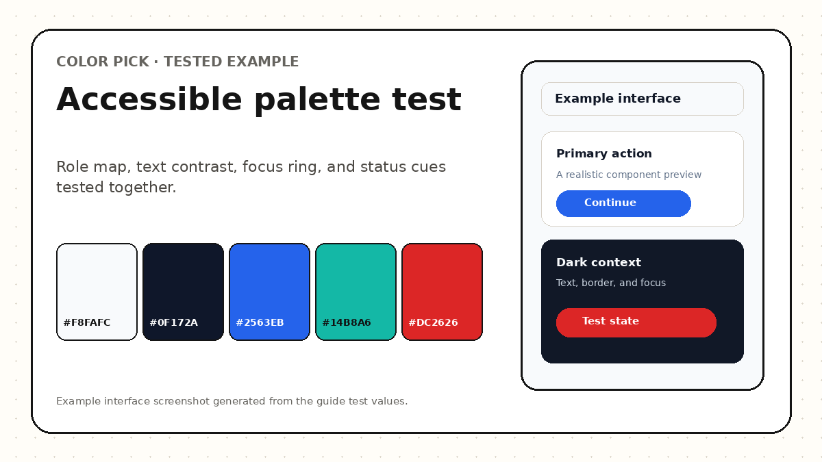
The test used a light page background, a white surface, dark body text, a blue primary action, teal supporting emphasis, and red error feedback. Each role was checked in the context where it would actually appear.
The review combined text contrast, component boundaries, focus visibility, status differentiation, grayscale review, and common color-vision simulations. Passing automated checks did not replace keyboard, zoom, content, or assistive-technology testing.
Tested example: roles and states are reviewed together rather than as an unlabeled swatch row.
Evidence recorded for the example
Check
Example evidence
Decision
Body text
Dark text on the light canvas
Keep as the default reading pair
Primary action
Button label tested against the blue fill
Use a role-specific foreground
Focus
Visible ring tested against page and control
Do not rely on a subtle color shift
Status
Icon, label, and color used together
Meaning survives reduced color perception
Put the guide into practice
Audit an accessible palette
Map roles, review critical blockers, compare vision modes, and generate a prioritized fix plan.
Yes. Accessibility limits specific relationships and uses, not creativity. Saturated colors can remain valuable for large surfaces, accents, charts, and illustrations when text and controls use appropriate variants.
Does color-blind simulation prove accessibility?
No. It identifies potential separation risks. Real accessibility also depends on non-color cues, semantics, layout, content, and user testing.
What should I fix first?
Fix unreadable body text, primary actions, focus indicators, and color-only status meaning before refining decorative details.
Primary references
These sources support the standards and technical explanations in this guide. Color Pick recommendations and product-specific limitations are identified separately in the article.