
Primary references
These sources support the standards and technical explanations in this guide. Color Pick recommendations and product-specific limitations are identified separately in the article.
Design layered dark surfaces, readable text, controlled chroma, accessible states, and theme-ready semantic tokens.
A dark-mode palette should use layered dark surfaces instead of a single black background, softened light text instead of maximum white everywhere, controlled accent chroma, and role-specific values for actions, borders, focus, and status states. Build dark mode as a semantic theme, then test contrast, glare, hierarchy, and component states independently from light mode.
Reversing every light value usually produces excessive glare, weak depth, and distorted brand colors.
Use a near-black base and one or more elevated surfaces. Maintain visible separation through lightness, borders, or shadows that are designed for dark backgrounds.
Preserve semantic role names so components switch values without changing meaning.
Layered surfaces help users understand elevation and grouping.
A dark page background can be slightly darker than cards, menus, and dialogs. Borders should remain visible without becoming bright outlines around every component.
Test the surfaces on common displays because very small dark differences can disappear with low-quality panels, brightness settings, or ambient light.
Pure white on pure black provides maximum numerical contrast but can feel harsh for long reading.
Use a softened near-white for body text while retaining enough contrast. Secondary text can be dimmer, but avoid pushing it below the intended contrast target.
Do not reduce opacity indiscriminately because compositing changes the effective color across different surfaces.
A vivid accent designed for white backgrounds can appear overly bright on a dark surface.
Create theme-specific action and status values. Often the dark-mode variant is lighter but slightly lower in chroma so it remains visible without blooming.
Check on-accent text separately. A lighter accent may require dark text even if the light-mode button used white text.
Dark mode needs explicit hover, active, selected, disabled, and focus values.
Ensure each state changes through more than a subtle hue shift. Focus indicators must contrast with the component and its surrounding surface.
Pay special attention to destructive actions, warning banners, data visualizations, and disabled controls because low-light designs can make state differences collapse.
Theme mappings keep component code stable.
:root {
  --surface-page: #F8FAFC;
  --surface-card: #FFFFFF;
  --text-primary: #0F172A;
}

[data-theme="dark"] {
  --surface-page: #0B1020;
  --surface-card: #151C2F;
  --text-primary: #E8EDF7;
}Evaluate dark mode as its own interface.
Review surface layers and component boundaries.
Check normal text, muted text, and on-action text.
Test accent and status colors for glare and separation.
Inspect hover, active, selected, focus, and disabled states.
Run grayscale and color-vision simulations.
Test at low and high screen brightness.
Verify system theme switching and saved preference behavior.
Dark-mode quality depends on layered surfaces, text hierarchy, focus, and feedback—not on replacing white with black.
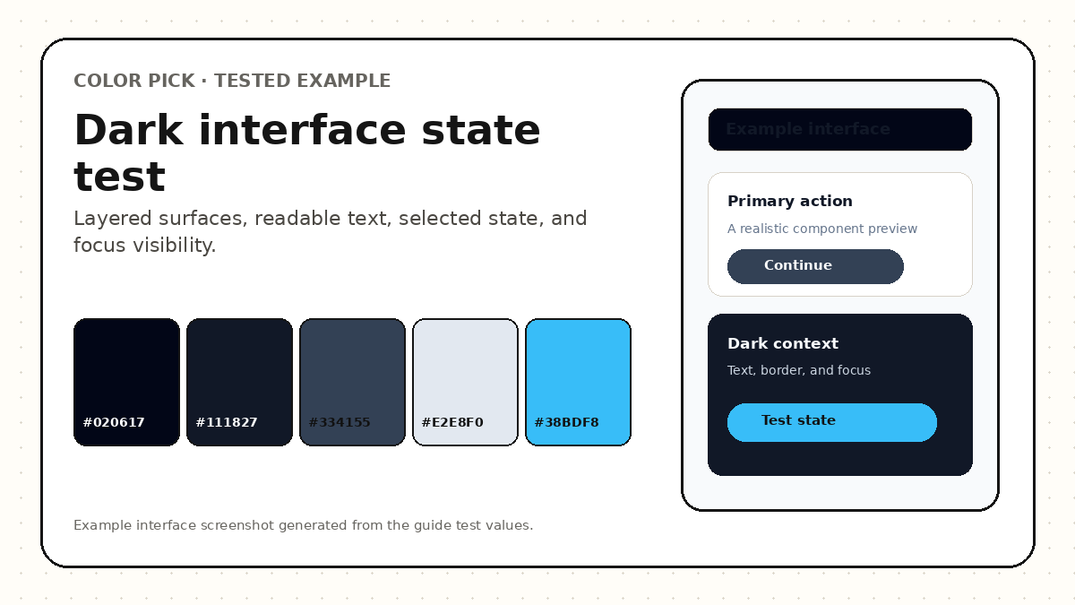
The example uses a near-black canvas, a slightly lighter surface, a visible border layer, softened light text, and a cyan action accent. The test covers navigation, cards, input boundaries, selected states, focus rings, and error feedback.
The accent is not assumed to be readable for every text size. Action labels, muted text, and subtle borders are checked separately against the surface where they appear.
Dark palettes fail when the design removes hierarchy or relies on opacity.
Dark mode should preserve hierarchy, readability, and semantic meaning.
Map semantic roles, compare light and dark readiness, and inspect website, mobile, and component states.
Not necessarily. Near-black values often provide better surface layering and reduce harsh contrast, although pure black can be appropriate for specific OLED or visual contexts.
Keep the brand identity, but create a role-specific dark-mode variant when the original value produces glare, weak contrast, or incorrect on-color text.
Supporting the system preference is useful, and many products also provide a user override that is stored locally.
These sources support the standards and technical explanations in this guide. Color Pick recommendations and product-specific limitations are identified separately in the article.