
Primary references
These sources support the standards and technical explanations in this guide. Color Pick recommendations and product-specific limitations are identified separately in the article.
Use pastel colors as accessible surfaces, accents, and states by pairing them with stable foregrounds, role mapping, OKLCH adjustments, and non-color cues.
Pastel colors are usually safest as backgrounds, surfaces, highlights, and decorative accents—not as small text. Pair them with a stable dark foreground, test each text pair, reserve darker variants for links and controls, and use labels, icons, or patterns when a pastel color communicates state. Adjust lightness and chroma in OKLCH while checking the rendered result.
Pastels cluster near high lightness, so adjacent values may look gentle but provide little contrast.
A pastel pink, blue, mint, and yellow row can feel balanced as a mood board while remaining unusable for body text, input boundaries, focus indicators, and status messages.
The solution is not to remove all pastels. Give them appropriate roles and add a stable foreground, border, and action system.
Pastels work well when the role does not require the color itself to carry small text or critical boundaries.
A pastel palette needs at least one dependable dark value and usually a stronger interactive family.
Use a dark neutral for body text and headings. For links, buttons, focus, and selected states, derive darker variants instead of using the light pastel directly.
Keep the pastel as a subtle token such as pink-subtle or mint-surface, then map the darker variant to action or status roles.
OKLCH helps separate perceived lightness from chroma while you tune a pastel family.
Lower lightness when a role needs more separation, then reduce or preserve chroma based on the intended character. Always check gamut mapping and the actual sRGB result because numeric regularity does not guarantee a usable rendered color.
Avoid generating all pastel roles by adding white in fixed RGB percentages. That can produce uneven perceived steps across hue families.
The example keeps the five pastel colors for surfaces and introduces one dark ink color for content.
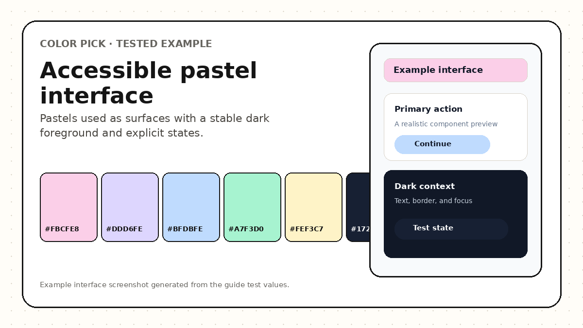
| Color | Recommended role | Avoid |
|---|---|---|
| #FBCFE8 | Pink subtle surface | Small pink text on white |
| #DDD6FE | Secondary card surface | Low-contrast lavender border |
| #BFDBFE | Information background | White body text |
| #A7F3D0 | Success subtle background | Green-only success meaning |
| #FEF3C7 | Warning subtle background | White label on yellow |
| #172033 | Primary text and strong border | Large background area when a softer mood is required |
Keep the mood, then add the missing structural roles.
Choose three to five pastel surfaces with distinct purposes.
Add a stable dark text color.
Create stronger variants for links, buttons, focus, and status.
Map every value to a semantic role.
Test normal text, large text, icons, and boundaries.
Review grayscale and color-vision simulations.
Preview realistic components before export.
A pastel palette cannot be judged from swatches or one contrast pair alone.
The largest risk is asking the light colors to perform every role.
Accessible pastel systems keep soft surfaces and add strong structural roles.
Import or create a pastel palette, assign roles, check contrast, and generate safer variants.
Yes, but the label and boundary still need suitable contrast. A darker text color or darker role variant is often more dependable than white text.
Individual combinations can meet specific contrast criteria, but accessibility depends on role mapping, component states, labels, keyboard behavior, and more than color alone.
No. Hues differ in perceived lightness and gamut behavior. Adjust each family while checking the rendered result and intended role.
These sources support the standards and technical explanations in this guide. Color Pick recommendations and product-specific limitations are identified separately in the article.