
Primary references
These sources support the standards and technical explanations in this guide. Color Pick recommendations and product-specific limitations are identified separately in the article.
Design status, charts, controls, and navigation that remain understandable under common color-vision differences and simulation limits.
Color vision deficiency can make hue differences less reliable, especially red–green distinctions. Keep meaning available through text, icons, patterns, position, shape, or line style; then use simulations to find likely collisions. A simulator is a design aid, not a diagnosis or a complete representation of every person’s vision.
Some hue distinctions become weaker or appear more similar, while lightness contrast may remain useful.
Protan and deutan conditions commonly affect distinctions along red–green relationships. Tritan conditions affect blue–yellow relationships differently. Individual experience varies, and display conditions also matter.
Designers should focus on whether information survives when a color distinction becomes weak, not on predicting one exact perceived color.
Status and interaction information should remain available when hue is removed or confused.
Green success and red error can converge for some viewers, especially when their lightness is similar.
Increase lightness separation, add explicit labels, and use distinct icons. For form validation, connect the message to the field and do not rely on a red border alone.
Selected tabs, toggles, and chart legends should have a shape, text, or position cue that remains visible without color.
A legend that only shows colored squares forces users to remember a hue mapping that may be unavailable.
Label important lines or bars directly.
Use markers, line styles, or patterns.
Keep adjacent series separated by lightness as well as hue.
Test grayscale and several simulation modes.
Check the chart at small sizes and zoomed views.
The example pairs every status color with a text label and icon.
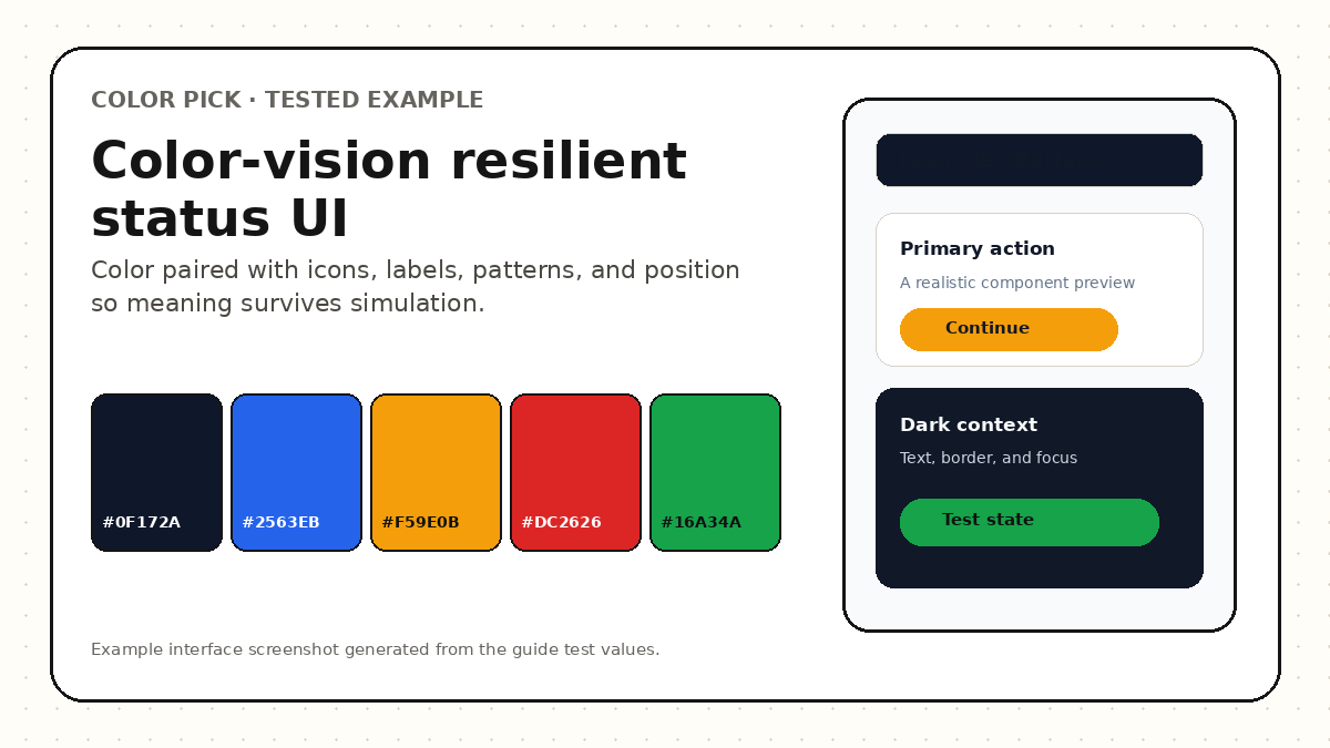
| State | Color cue | Additional cue |
|---|---|---|
| Information | Blue | Info icon and label |
| Success | Green | Check icon and “Completed” text |
| Warning | Amber | Triangle icon and action text |
| Error | Red | Error icon, message, and field association |
Use simulation to find collisions, then verify that non-color cues still communicate the result.
Preview the normal interface first.
Run protanopia and deuteranopia simulations.
Run tritanopia and grayscale views.
Identify states or series that become difficult to distinguish.
Add labels, icons, shape, patterns, or lightness separation.
Retest the normal and simulated views.
Confirm with broader accessibility testing and user feedback where possible.
Simulation matrices simplify complex human vision and display behavior.
A simulation can reveal probable color collisions, but it cannot represent every severity, adaptation, device, or individual experience. It should not be presented as a medical model or proof of accessibility.
Use simulation as one part of a workflow that includes contrast, non-color cues, keyboard and zoom review, content clarity, and representative user testing.
Most failures occur when a hue difference is the only clue.
Resilient interfaces keep meaning available even when hue distinctions weaken.
Compare normal, protan, deutan, tritan, and grayscale views while keeping the original palette editable.
It is an approximation that can reveal likely collisions. It does not reproduce every individual’s vision and should not be used as certification.
Review normal, protan, deutan, tritan, and grayscale contexts when those modes are available. Prioritize the states and charts that carry important meaning.
No. Good lightness contrast helps, but information still needs labels, icons, patterns, shape, or position when color communicates meaning.
These sources support the standards and technical explanations in this guide. Color Pick recommendations and product-specific limitations are identified separately in the article.