
Primary references
These sources support the standards and technical explanations in this guide. Color Pick recommendations and product-specific limitations are identified separately in the article.
Map raw palette values to stable background, surface, text, action, feedback, focus, and interaction roles for light and dark interfaces.
Build semantic UI colors by separating raw values from product roles. Keep a base scale such as blue-500 or slate-900, then map those values to tokens such as background, surface, text, primary action, on-primary, border, focus, success, warning, and error. Create separate light and dark role maps while preserving the same semantic names.
A semantic token remains meaningful when the underlying color changes.
Names such as blue-600 or cool-gray-50 describe appearance or position in a scale. Names such as action-primary, text-muted, surface-elevated, and status-error describe purpose.
Keep both layers. Raw scales make systematic adjustment possible; semantic aliases let components consume stable product meaning.
A small complete role map is more useful than a large unlabeled palette.
| Role | Purpose | Typical requirement |
|---|---|---|
| background | Page canvas | Supports all content layers |
| surface | Cards and panels | Distinct from background |
| text-primary | Main reading text | Strong readable contrast |
| text-muted | Secondary information | Readable without competing |
| action-primary | Main interactive action | Clear label and states |
| on-primary | Content on primary action | Test against action fill |
| border | Inputs and separation | Meaningful boundaries remain perceivable |
| focus | Keyboard focus indicator | Visible against adjacent colors |
| success / warning / error | Feedback states | Use non-color cues too |
A single primary color cannot represent default, hover, active, selected, focus, and disabled behavior by itself.
Components should ask for a role, not a theme-specific color.
In light mode, background may use a near-white value while surface uses white. In dark mode, both become layered dark values. The component still requests background and surface.
Accent values often need separate dark-theme variants because identical RGB values can feel more intense on dark surfaces and may produce different readability results.
The example maps six values into a small but usable interface system.
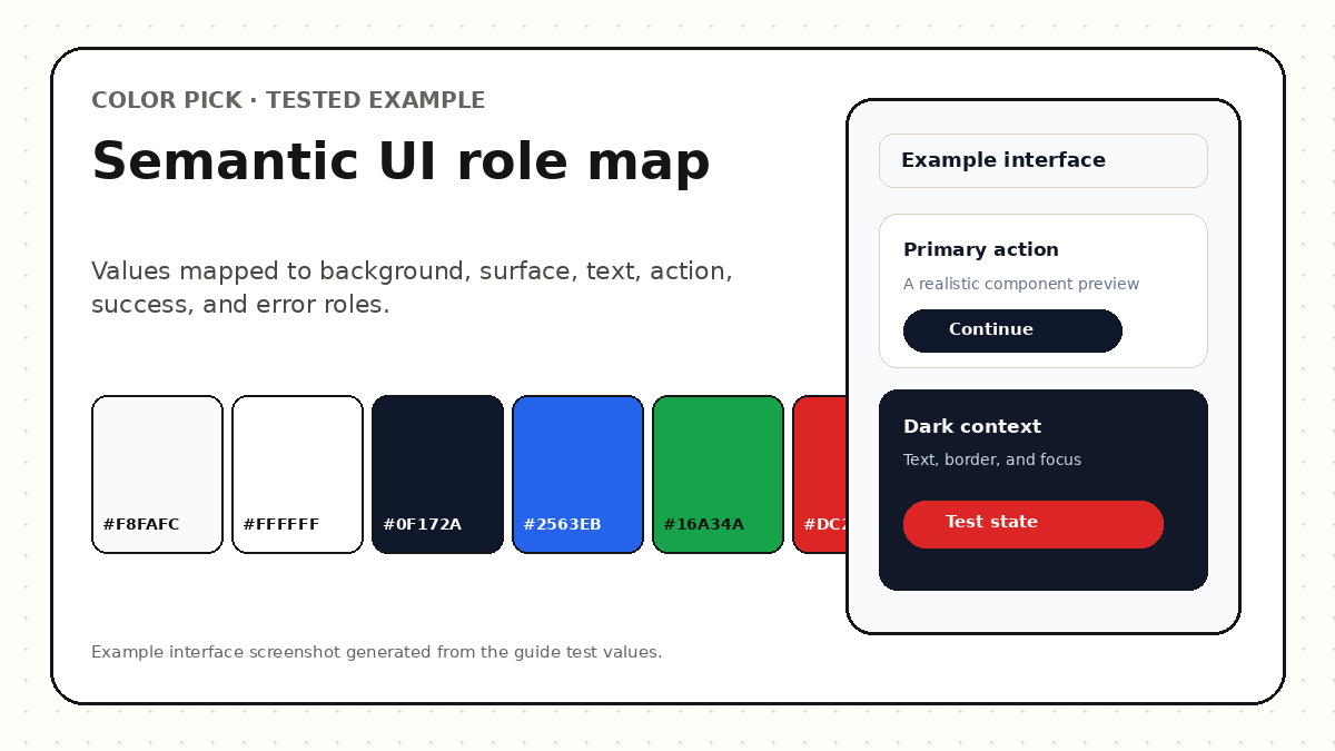
| Token | Light value | Dark value |
|---|---|---|
| --color-background | #F8FAFC | #0F172A |
| --color-surface | #FFFFFF | #111827 |
| --color-text | #0F172A | #F8FAFC |
| --color-action | #2563EB | #60A5FA |
| --color-success | #16A34A | #4ADE80 |
| --color-error | #DC2626 | #F87171 |
Map, test, and export roles before wiring them into components.
Create or import the raw palette.
Generate a light and dark base scale where needed.
Assign background, surface, text, action, focus, and feedback roles.
Preview buttons, fields, navigation, cards, and alerts.
Check contrast and color-vision resilience.
Export CSS or design tokens and keep role names stable.
The role map was reviewed in actual component relationships rather than by inspecting token values alone.
Weak systems usually mix raw colors and roles without a clear contract.
Semantic tokens connect visual values to stable product meaning.
Assign semantic roles, preview interfaces, test readiness, and export reusable tokens.
Prefer purpose-based names for component-facing tokens. Raw palette tokens may retain color-family or numeric names, but components should consume role names.
No. Keep semantic names stable and switch the mapped values by theme.
Start with background, surface, primary and muted text, primary action and foreground, border, focus, success, warning, error, and disabled roles. Add more only when a real component requires them.
These sources support the standards and technical explanations in this guide. Color Pick recommendations and product-specific limitations are identified separately in the article.