
Primary references
These sources support the standards and technical explanations in this guide. Color Pick recommendations and product-specific limitations are identified separately in the article.
Build a perceptually balanced Tailwind 50–950 color scale with semantic tokens, accessible states, and export examples.
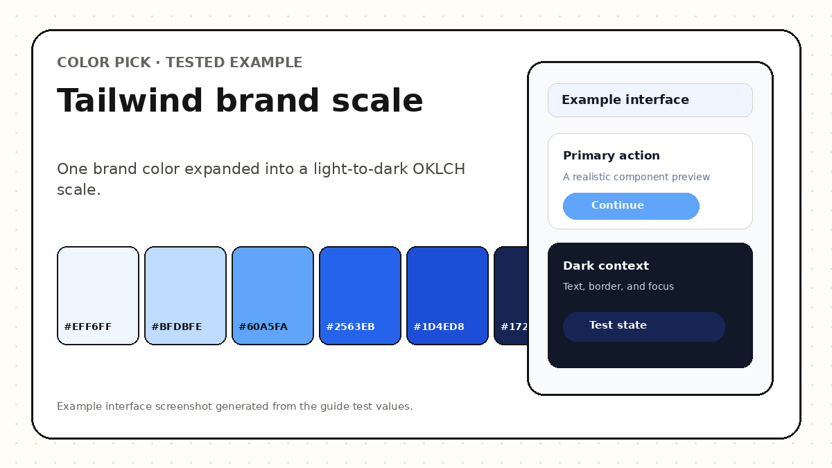
A useful Tailwind color scale is not a fixed percentage mix from white to black. Choose a base color, define the lightness range needed by your interface, use a perceptual space such as OKLCH to control progression, check gamut and contrast at each role, then export the scale as theme variables and semantic tokens.
The base color should represent the brand or product role that anchors the scale.
Decide which shade label should contain the original color. Many systems place a primary brand value near 500 or 600, but the correct position depends on its lightness and expected usage.
Preserve the original value as a documented token so generated shades can be recalculated without losing the source.
The 50–950 labels are ordered design tokens, not scientific measurements.
Light shades often serve backgrounds, selected rows, and subtle borders. Middle shades carry brand accents and controls. Dark shades support hover states, dark text, or dark-theme surfaces.
Uneven perceptual jumps make a scale difficult to use. Review the sequence visually and compare lightness differences rather than relying only on equal numeric interpolation.
OKLCH separates lightness, chroma, and hue so each dimension can be adjusted deliberately.
Lightness can move from near-white to near-black while chroma peaks around the useful middle of the scale. Hue can remain stable or receive small corrections to prevent muddy dark values and washed-out light values.
Clip or reduce chroma when a generated shade falls outside sRGB, and retain an sRGB fallback for broad compatibility.
Components should consume role names rather than raw shade labels whenever possible.
For example, --color-action can point to a 600 shade in light mode and a 400 shade in dark mode. This allows the scale to remain stable while roles adapt across themes.
Create tokens for action, action-hover, action-active, focus, subtle background, border, and on-action text.
@theme {
  --color-brand-50: oklch(97% 0.02 250);
  --color-brand-500: oklch(62% 0.20 250);
  --color-brand-900: oklch(30% 0.10 250);
}

:root {
  --color-action: var(--color-brand-600);
  --color-action-hover: var(--color-brand-700);
}A scale is only useful when adjacent state values remain distinguishable and readable.
Test default, hover, active, focus, selected, disabled, loading, and visited states. Confirm that on-color text meets the intended contrast target and that focus remains visible around the component.
Check dark mode separately because the same shade numbers may not provide the right visual hierarchy on a dark surface.
A vivid blue base can retain hue while lightness expands and chroma is reduced at the extremes.
Use low-chroma near-white values for 50 and 100, increase chroma through the middle shades, then reduce chroma again toward 900 and 950. The exact values should be inspected in the final browser gamut.
Color Pick lets you edit generated shades individually, preview website and mobile components, and export CSS variables or Tailwind-compatible data.
| Shade range | Typical role | Validation |
|---|---|---|
| 50–100 | Subtle background | Contrast with text and borders |
| 200–300 | Borders and selected surfaces | Adjacent separation |
| 400–600 | Brand and primary actions | On-color text and focus |
| 700–800 | Hover and active states | State distinction |
| 900–950 | Dark text or dark surfaces | Readability and hue stability |
A useful scale becomes a token API only after its steps are named and connected to utilities.
Tailwind CSS exposes custom colors through the --color-* theme-variable namespace. A generated scale can therefore become bg-brand-500, text-brand-700, border-brand-200, and similar utilities without copying values into every component.
Keep semantic aliases such as --color-action and --color-focus separate from the raw numeric scale. The raw scale describes progression; semantic tokens describe product meaning.
@import "tailwindcss";

@theme {
  --color-brand-50: oklch(97.5% 0.018 255);
  --color-brand-500: oklch(59% 0.19 255);
  --color-brand-700: oklch(42% 0.16 255);
  --color-brand-950: oklch(18% 0.06 255);
}A generated sequence still needs product decisions.
A Tailwind scale should be perceptually ordered, role-aware, and tested in components.
Choose a base color, regenerate the scale, edit any shade, preview UI contexts, and export the result.
No. Those labels are a common convention. Use the number and naming system that supports your project, while keeping the progression predictable.
Place the source near the label that matches its actual lightness and intended use. Do not force every brand color into 500.
Yes, but semantic roles usually point to different shades in each theme.
These sources support the standards and technical explanations in this guide. Color Pick recommendations and product-specific limitations are identified separately in the article.