
Focused, technical, calm, and nocturnal.
Near-black and navy surfaces create depth without pure-black glare, while cyan supplies a crisp interactive signal.
A layered dark blue palette with softened light text and a cyan action accent for dashboard and developer interfaces.
#020617#111827#334155#E2E8F0#38BDF8Near-black and navy surfaces create depth without pure-black glare, while cyan supplies a crisp interactive signal.
CMYK values are generic planning approximations. Final print output requires a target ICC profile and physical proof.
| Color | HEX | RGB | OKLCH | CMYK approximation | Nearest CPS |
|---|---|---|---|---|---|
#020617 | 2, 6, 23 | oklch(12.9% 0.041 265) | 91% / 74% / 0% / 91% | CPS 36950NΔE00 4.57 | |
#111827 | 17, 24, 39 | oklch(21% 0.032 265) | 56% / 38% / 0% / 85% | CPS 22950SΔE00 3.91 | |
#334155 | 51, 65, 85 | oklch(37.2% 0.039 257) | 40% / 24% / 0% / 67% | CPS 36800NΔE00 4.90 | |
#E2E8F0 | 226, 232, 240 | oklch(92.9% 0.013 256) | 6% / 3% / 0% / 6% | CPS 36100NΔE00 1.68 | |
#38BDF8 | 56, 189, 248 | oklch(75.4% 0.139 233) | 77% / 24% / 0% / 3% | CPS 21300EΔE00 1.51 |
This role map is a practical starting point. Validate it against the real components, text sizes, and interaction states in your product.
Deep page background
Cards and navigation
Inputs and separators
Body and heading text
Links, focus, selected states
These previews reveal role assumptions that are invisible in a simple swatch strip.
Role-based color preview
ReadyCheck the real relationships
ActiveTest text, controls, and states before export.
The palette relies mainly on lightness hierarchy, which remains useful when hue perception changes, but cyan should not be the only selected-state cue.
This is a screen-first palette. Large dark print areas require ink-limit planning and proofing.
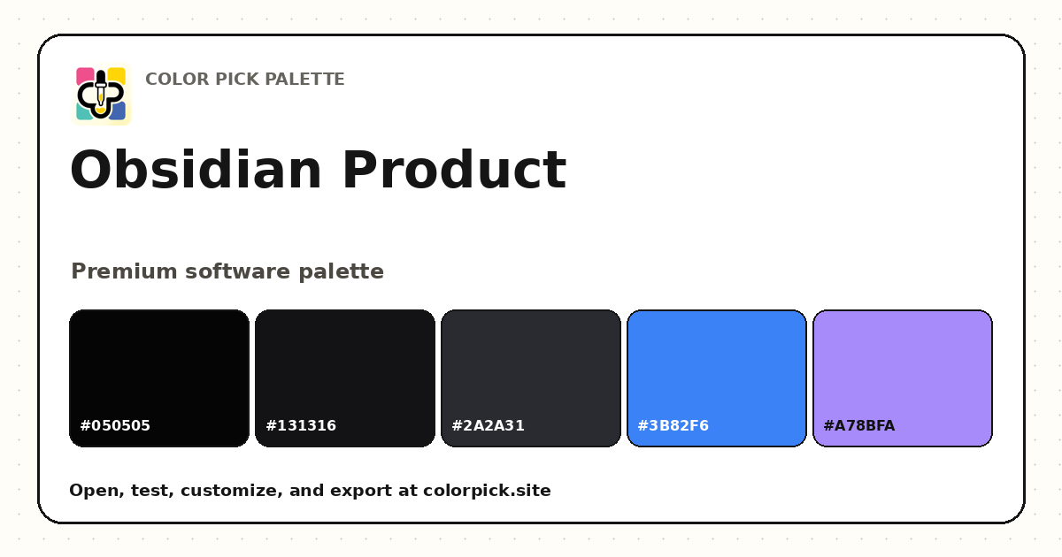 Obsidian Product Dark Color Palette
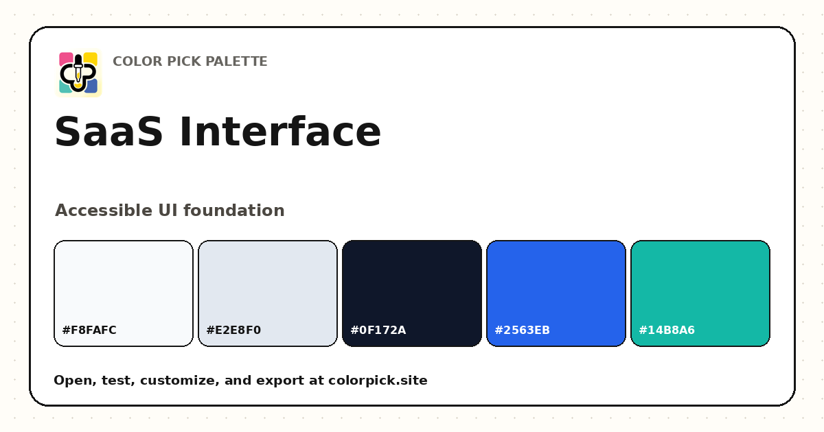 SaaS Interface Color Palette
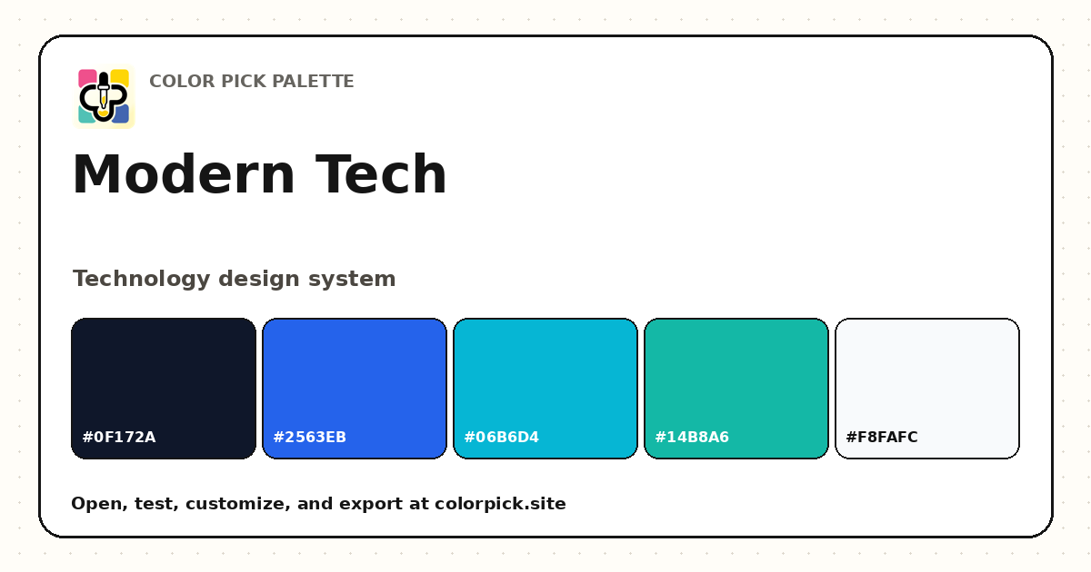 Modern Tech Color Palette