
Clear, dependable, modern, and product-focused.
The quiet slate foundation keeps dense application content readable while blue and teal provide distinct action and supporting emphasis.
A practical SaaS interface palette with cool surfaces, strong dark text, a blue primary action, and teal secondary emphasis.
#F8FAFC#E2E8F0#0F172A#2563EB#14B8A6The quiet slate foundation keeps dense application content readable while blue and teal provide distinct action and supporting emphasis.
CMYK values are generic planning approximations. Final print output requires a target ICC profile and physical proof.
| Color | HEX | RGB | OKLCH | CMYK approximation | Nearest CPS |
|---|---|---|---|---|---|
#F8FAFC | 248, 250, 252 | oklch(98.4% 0.003 248) | 2% / 1% / 0% / 1% | CPS 34050NΔE00 0.64 | |
#E2E8F0 | 226, 232, 240 | oklch(92.9% 0.013 256) | 6% / 3% / 0% / 6% | CPS 36100NΔE00 1.68 | |
#0F172A | 15, 23, 42 | oklch(20.8% 0.04 266) | 64% / 45% / 0% / 84% | CPS 22950SΔE00 2.92 | |
#2563EB | 37, 99, 235 | oklch(54.6% 0.215 263) | 84% / 58% / 0% / 8% | CPS 23500EΔE00 2.17 | |
#14B8A6 | 20, 184, 166 | oklch(70.4% 0.123 183) | 89% / 0% / 10% / 28% | CPS 16400BΔE00 3.97 |
This role map is a practical starting point. Validate it against the real components, text sizes, and interaction states in your product.
Primary application canvas
Subtle component structure
Headings and body text
Buttons, links, selected states
Supporting data and highlights
These previews reveal role assumptions that are invisible in a simple swatch strip.
Role-based color preview
ReadyCheck the real relationships
ActiveTest text, controls, and states before export.
Blue and teal can move closer in some simulations, so primary and secondary actions should also differ by label, placement, or component style.
Suitable as a digital-first palette. Any CMYK values shown are generic planning approximations and require a real profile and proof for print.
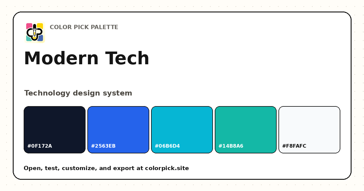 Modern Tech Color Palette
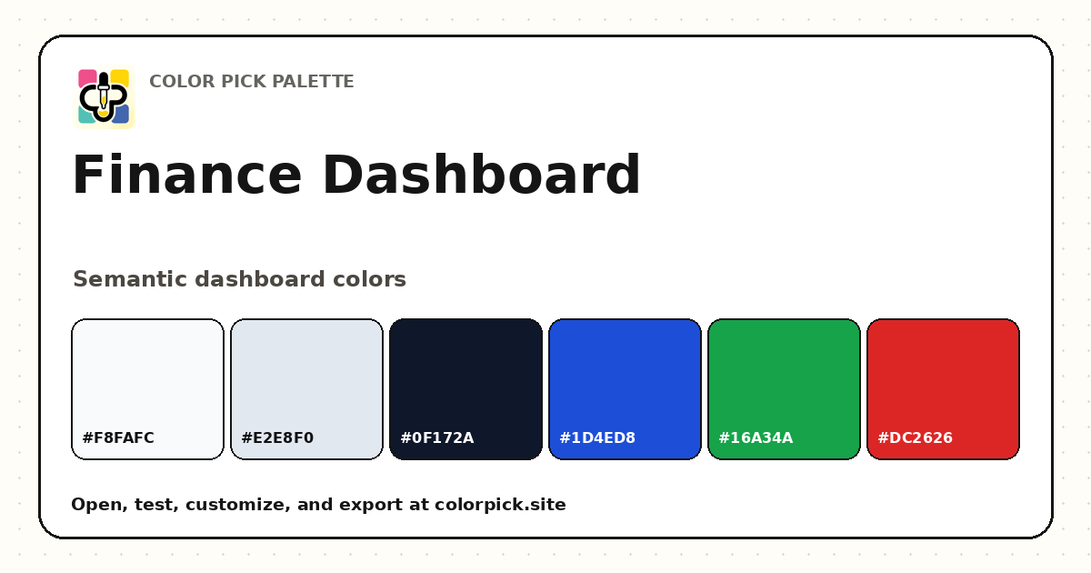 Finance Dashboard Color Palette
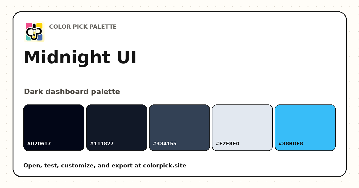 Midnight UI Dark Color Palette