
Primary references
These sources support the standards and technical explanations in this guide. Color Pick recommendations and product-specific limitations are identified separately in the article.
Test real button labels, fills, borders, focus rings, icons, and interaction states with a measured WCAG contrast matrix and a repeatable component workflow.
Test a button as several separate relationships: label versus fill, meaningful icon versus fill, required boundary versus adjacent surface, and focus indicator versus every adjacent color. Normal-size labels generally need 4.5:1, while meaningful component boundaries and custom focus indicators commonly use a 3:1 target. Repeat the checks for every state.
A button can pass one contrast check while another required visual cue remains difficult to perceive.
Button text is evaluated against the button fill. A border or shape that is required to identify the control is evaluated against the adjacent background. Icons that carry meaning need suitable contrast in their own context. A custom focus indicator must remain visible against adjacent colors.
Do not collapse these checks into one average score. Record the foreground, background, component state, text size, and purpose for every tested pair.
Most button labels use the normal-text target because the label is not large enough to qualify for the lower large-text threshold.
WCAG 2.2 requires a 4.5:1 contrast ratio for normal text and 3:1 for large-scale text. Do not assume a bold label automatically qualifies as large text; use the actual rendered size and weight definition.
Disabled controls are treated differently by the normative contrast criteria, but they should still remain understandable in the product context. Avoid making disabled labels so faint that users cannot tell what action exists.
| Example | Target | Note |
|---|---|---|
| 14 px semibold label | 4.5:1 | Normal text |
| 18 px bold label | Check the large-text definition | Do not rely on visual impression |
| Icon-only control | 3:1 for meaningful graphic details | Also provide an accessible name |
| Inactive control | No normative minimum under the cited criteria | Keep it understandable |
Hover, focus, active, selected, loading, and destructive states can introduce new contrast failures.
Capture the default label, fill, border, and surrounding surface.
Repeat the label and boundary checks for hover and active states.
Tab to the control and check the focus indicator against every adjacent color.
Test selected or pressed states with more than a subtle color shift.
Review loading and disabled labels for clarity.
Test destructive actions with an icon or text cue in addition to red.
This measured example separates label readability, component recognition, and focus visibility across five practical states.
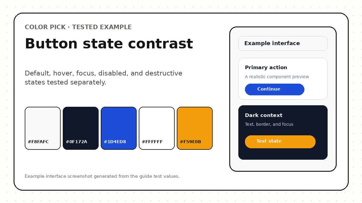
The state matrix below calculates exact contrast ratios for a primary button system on a white application surface. The default, hover, active, and warning states use explicit text, fill, border, and outer-focus-ring colors rather than one combined score.
The focus example assumes a small white separation gap before the outer ring. If the ring directly touches the button fill, test that additional adjacent-color relationship as well. Disabled controls are reported for clarity but are not presented as ordinary WCAG conformance claims.
| State | Primary pair | Measured result |
|---|---|---|
| Default | #FFFFFF on #1D4ED8 | 6.70:1 label contrast |
| Hover | #FFFFFF on #1E40AF | 8.72:1 label contrast |
| Active | #FFFFFF on #172554 | 14.69:1 label contrast |
| Warning | #111827 on #F59E0B | 8.26:1 label contrast |
| Disabled | #64748B on #DBEAFE | 3.90:1; review clarity rather than claiming ordinary conformance |
Use the Contrast Checker for pairs, then validate the complete component in the real interface.
Enter the label color as foreground and fill as background.
Set a representative text size and weight.
Record AA and AAA results without rounding borderline ratios upward.
Test borders, icons, and focus indicators against adjacent colors.
Repeat for all interactive states.
Verify keyboard focus, zoom, touch targets, and labels in the product.
A color-pair checker cannot certify the accessibility of a button or product.
The most common failures come from checking only the default label pair.
A button is a set of text, graphic, boundary, and state relationships.
Check label, fill, border, icon, and focus colors, then compare accessible alternatives.
Only visual information required to identify the control or its state is covered by non-text contrast. A text button may remain identifiable through its label and context, but clear boundaries are still a strong usability practice.
Inactive controls are excluded from the cited contrast success criteria, but the disabled action should still be understandable and should not look like missing content.
Not necessarily. The key requirement is that the component and meaningful state indicators remain perceivable. Do not rely on a subtle color-only change when users need to understand a state.
These sources support the standards and technical explanations in this guide. Color Pick recommendations and product-specific limitations are identified separately in the article.